


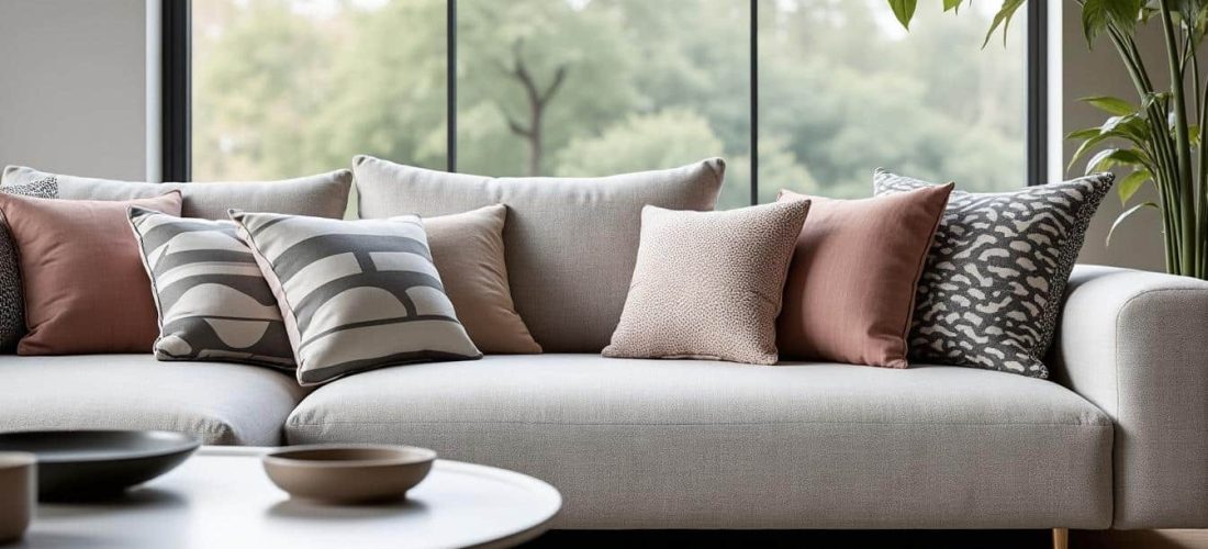
Mixing motifs and prints remains a decisive skill for personal style and interior design. The aim is to assemble patterns without overwhelming the eye while keeping coherent palettes. This piece explores practical rules that make mix and match reliable and enjoyable.
Designers from Desigual to Marimekko have revived playful combinations on runways and streets. Practical steps simplify choices around scale, color harmony, and rhythm in patterns. Below are concise guidelines to apply when planning a confident mix and match.
A retenir :
- Large and small motifs for clear visual contrast
- Coordinated color palette with one dominant and two accents
- Mix of regular patterns and organic prints for rhythmic balance
- Accessories as controlled motif introductions for subtle personality
Because scale anchors the composition, choose motif sizes deliberately for balanced mix. Focus on size relationships and contrast, then move to color palettes for cohesion.
Choosing scale first gives a reliable visual hierarchy and prevents clutter in outfits and interiors. Small motifs paired with a dominant large pattern create a readable contrast that guides the eye.
Practical choices come from observation of brands like Missoni and Etro that play scale boldly without disorder. Selon Vogue, designers often start with one anchor piece and adjust supporting motifs around it.
Scale choices guide :
- Small motifs as texture rather than focal point
- Medium motifs for coordinated middle ground
- Large motifs as anchor statement pieces
Motif size Visual role When to use Example brand Small Texture and subtlety Layering under dominant pieces Sézane Medium Supporting interest Balanced separates and cushions Paul Smith Large Anchor and statement Feature garment or rug Marimekko Mixed Dynamic contrast Curated ensembles and galleries Desigual
« I learned to mix scale by anchoring one large print with smaller motifs for everyday outfits »
Marie D.
Small and large motifs pairing for readable contrast
When a large motif serves as the focal point, smaller prints provide rhythm without competing for attention. Combining sizes requires attention to spacing and repeat frequency to avoid visual noise.
Try a large floral dress with a fine striped scarf or a cushion in a micro-dot print for subtle layering. Selon Elle, street stylists often trust simple repetition and one linking color to unify ensembles.
Techniques to balance motif scale across garments and rooms
Practical techniques include limiting the number of dominant scales and repeating color points to ensure coherence. A single bold piece surrounded by restrained motifs keeps the composition legible and stylish.
Technique Effect Application Repeat a linking color Unifies disparate prints Use in accessories and trims Vary motif density Prevents visual fatigue Mix dense and sparse repeats Reserve neutral ground Provides breathing space Solid walls or large furniture pieces Scale gradation Creates smooth contrast From tiny to large across layers
Because scale sets the framework, color coordination becomes the decisive layer for harmony. Next we examine palettes and strategic use of accents to avoid chromatic clashes.
Color decisions bind patterns together and reduce perceived disorder by creating visual links across different motifs. A coordinated palette prevents clashes and highlights intended focal points.
Start with one dominant hue and one or two accent tones to keep the scheme focused and safe. Selon The Guardian, many successful mixes rely on muted neutrals paired with a vivid accent for personality.
Color palette choices :
- One dominant hue for visual unity
- One or two accent colors for controlled contrast
- Neutral backgrounds to ease pattern density
Palette approach Strength When to choose Brand example Monochrome shades Elegant and safe Office wear and minimalist interiors Sandro Complementary accents Vibrant contrast Statement looks and playful rooms Desigual Analogous tones Soothing cohesion Soft living spaces Antik Batik Neutral ground Visual rest Balance for busy motifs Ba&sh
« I found that limiting to two accent colors changed chaotic outfits into considered looks with intention »
Liam B.
Choosing palettes that connect disparate patterns
Link colors through small repeats or accessory notes to create a clear visual thread between prints. This small effort makes combinations feel deliberate and curated rather than accidental.
Use a swatch exercise before committing to garments or upholstery to spot clashes and strengthen cohesion. Selon Vogue, fashion editors frequently test palettes against neutrals to measure impact objectively.
Practical palettes and examples from pattern houses
Look at houses like Etro and Missoni to observe rich palettes anchored by a dominant tone and playful accents. These brands illustrate how complex prints can remain legible with disciplined color strategies.
- Study brand palettes for real-world templates
- Swap accessories to test color interactions
- Create a small mood board before purchase
Because scale and color guide the setup, rhythm and accessories finalize the composition. The final section shows how texture, regularity, and curated accents produce personality without overload.
Rhythm emerges from alternating regular motifs with freer organic prints, which keeps the eye engaged and prevents monotony. Accessories act as controlled motif introductions that show intent and taste.
Experimentation is welcome, but apply filters like scale, shared color, and neutral space to maintain clarity. Designers such as Kenzo and Paul Smith often use rhythmic repetition to achieve dynamic balance.
Accessory and rhythm tips :
- Use scarves or cushions to introduce a new motif safely
- Limit bold accessories to one or two per outfit
- Alternate structured and organic prints for visual rhythm
« My living room felt cohesive after I added two patterned cushions that echoed the rug colors »
Olga M.
Element Role Practical tip Accessory Introduce controlled motif Use as accent with linked color Texture Add depth and tactile interest Mix knit and smooth finishes Regular pattern Provides rhythm Balance with organic prints Neutral field Gives breathing space Reserve large solids as rest areas
« An opinion from a stylist: restraint in accessories makes every print read stronger »
Alex P.
Applied practice rewards careful observation and modest experiments that respect scale, color, and rhythm. Try small swaps and document combinations to refine a personal approach that reads intentional and stylish.
Consistent rules transform fearless mixing from risky to reliable while preserving personal expression and creativity. The methods above enable playful combinations inspired by labels like Etro, Missoni, and Antik Batik.


