


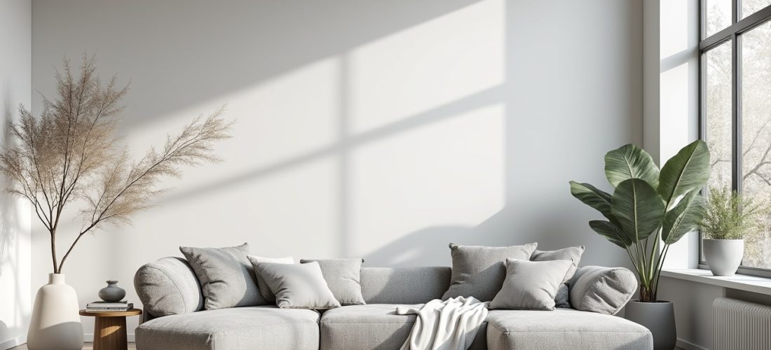
A monochrome approach can turn a home into a serene retreat after a busy day. Balancing shades, textures and light produces a quiet ambiance that supports calm and rest.
Working with a single dominant hue simplifies choices while allowing fine-grained nuance through value and material. These principles lead naturally to a concise list of essentials that follow.
A retenir :
- Palette unique pour une ambiance apaisante et cohérente
- Textures variées lin velours bois pour relief tactile et visuel
- Valeurs contrastées pour une profondeur maîtrisée et douce
- Éclairage diffus et points focaux pour atmosphère sereine
Monochrome Decoration: choosing a base color for lasting calm
Building on those takeaways, selecting a base color anchors the scheme and defines emotional tone across the intérieur. Consider orientation, light and intended use to pick a color that supports calme and sustained comfort.
According to practical rules, blue tones promote rest while greens bring balance and warmth when paired with wood. Selon Architectural Digest, restrained palettes tend to favour perceived spaciousness and reduced visual clutter.
Color choice prepares material and lighting decisions that will follow in the next section about textures and finishes. The next step examines how materials and values translate that base color into tactile harmony.
Base color psychology and room function
This subsection links the base hue to the specific function of each room and to occupant needs. Choose cooler blues for bedrooms and bathrooms to encourage sleep and quiet, and consider green for studies to support focused calm.
Selon Houzz, matching color to room orientation improves perceived warmth and comfort through seasonal cycles. Practical tests on small samples help avoid surprises under different lighting conditions.
Color Emotional association Ideal rooms Blue Calm serenity and trust Bedrooms, bathrooms Green Nature balance and renewal Living spaces, home offices Gray Neutrality and sophisticated backdrop All rooms Beige Warmth and comfort Living rooms, bedrooms
Practical testing and sample evaluation
This paragraph connects sample testing to the earlier table and to lighting choices that reveal subtle shifts in hue and value. Always paint multiple swatches on different walls and observe them across morning and evening light.
Selon Elle Décoration, even small hue shifts affect perceived warmth and scale in modern spaces. These observations feed directly into material selections described in the next major section.
Texture options:
- Lin naturel pour une sensation douce et respirante
- Velours profond pour confort et intensité chromatique
- Bois brut pour chaleur et contraste organique
- Métal brossé pour modernité et point d’éclat
Material and texture strategies to avoid flat monochrome spaces
Following color selection, layering materials and textures prevents a monochrome scheme from feeling flat or sterile. Prioritizing tactile contrast creates visual depth while preserving overall harmonie and minimalist clarity.
Start with large surfaces in medium values and add accents in darker or lighter values for structure and focus. This order helps the eye travel naturally and supports a relaxed atmosphere.
Combining fabrics and finishes for tactile contrast
This section connects fabric choices back to room function and to the earlier material list for a coherent plan. Mix matte and slightly reflective surfaces to create subtle highlights without breaking the monochrome intent.
Use rugs and cushions in varied pile heights, and select upholstery with distinct weaves to catch light differently. A layered textile approach makes the ambiance feel lived-in and inviting rather than austere.
Decor objects checklist:
- Large rug anchoring seating area in matching tones
- Sculptural vase as a soft focal point
- Textured throws to add warmth and depth
- Framed monochrome art to guide the eye
Materials performance and maintenance considerations
This subsection links material choices to long term use and to cleaning needs in family households. Select durable fabrics and finishes where traffic is high and softer materials in restful zones to balance wear and comfort.
Simple maintenance advice extends the life of textured materials and preserves the intended sérénité of your décor. These choices naturally lead toward lighting and focal composition discussed next.
Light and focal design for mood modulation:
- Layered lighting for adjustable mood and function
- Soft diffusers for even ambient glow
- Directional spots for artwork and accents
- Dimmer systems to tune day to evening atmospheres
Well chosen lighting translates textures and values into a cohesive visual narrative that sustains calm and focus. Proper light planning prepares the space for the final phase of personalization and styling.
Below is a small case reflection from a homeowner who adopted a monochrome scheme recently.
« I repainted my living room in soft gray and added layered textiles, and suddenly the space felt calm and ordered. »
Claire D.
Styling, personalization and pitfalls to avoid in monochrome interiors
After refining color, material and light, styling personal items gives the scheme emotional resonance and tells your story. Thoughtful curation prevents the monochrome scheme from appearing generic and increases daily comfort and attachment.
Start with a few meaningful objects and resist filling shelves indiscriminately, which creates visual noise and undermines the intended calm. This restraint supports both minimalisme and an intimate harmonie.
Personal objects that respect the monochrome logic
This paragraph links object selection to emotional value and to spatial balance for cohesive styling. Choose pieces with complementary textures rather than contrasting colors, to keep the eye engaged without distraction.
Small collections of ceramics, books and framed prints work well when arranged by tone or material. According to a recent design roundtable, grouped objects in one tone increase perceived order and calm.
« I curated only objects I love and grouped them by tone, which made the room feel intentional and calm. »
Marc L.
Common mistakes and corrective actions
This section connects typical missteps to simple remedies that restore balance and visual interest. Avoid a single flat value across all surfaces, and instead introduce slight value shifts to delineate functional zones.
For rooms that feel too sterile, add warm natural materials or a darker accent to anchor the layout and to provide a focal depth. These corrections lead naturally to examples and inspirations in the following media resources.
Below is a short testimony from a professional stylist about monochrome benefits.
« A restrained palette allows texture and shape to become the main design language, producing calm interiors. »
Sarah B.
For practical inspiration, consult curated visual guides and hands-on tutorials that demonstrate painting, layering and styling in real homes. The next embedded videos offer concrete examples and step-by-step demonstrations useful for readers.
Video resource one demonstrates paint selection and sample testing for natural light conditions.
Video resource two offers styling advice with textiles and accessories to enhance a monochrome design approach.
Final testimonial and expert opinion are shown below to encapsulate user experience and professional view on monochrome decorating. These perspectives highlight practical outcomes and guide sensible experimentation.
« My bedroom became a sanctuary after switching to a single palette and adding layered linens and soft lighting. »
Emma P.
« Designers often recommend testing samples and prioritizing texture when adopting a monochrome scheme. »
Prénom N.
Source : Architectural Digest, « How to master a monochrome palette », 2024 ; Houzz, « Choosing paint samples wisely », 2023 ; Elle Décoration, « Texture and tonal harmony in interiors », 2022.


