


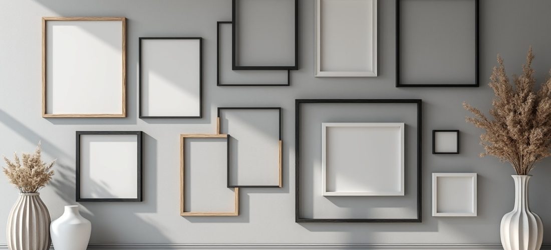
Asymmetrical framing offers a precise way to personalize narrow passages and enliven ordinary hallways. The approach favors deliberate imbalance, guiding the eye while preserving an integrated home atmosphere.
This practical guide explains placement rules, material choices and installation techniques for an effective mur décoratif in corridors. The following compact checklist clarifies the choices and prepares the practical steps that follow.
A retenir :
- Visual center between 145 and 155 centimeters high
- Spacing between frames approximately 4 to 8 centimeters
- Gap above furniture 15 to 25 centimeters
- Material repetition across frames two or three occurrences
How asymmetrical frames personalize hallway decoration
Building on the quick takeaways, asymmetrical compositions give hallways a sense of journey and narrative through varied anchors. This section develops concrete layout principles that transform a simple passage into a curated visual route.
Defining the visual center for hallways
This paragraph links the checklist to the selection of a visual pivot for the gallery on a narrow wall. Choosing a pivot anchors the composition and helps distribute visual weight across the surrounding pieces.
Element Recommended metric Purpose Visual center height 145–155 cm Comfortable viewing for standing observers Gap above furniture 15–25 cm Avoids floating or crushed appearance Frame spacing 4–8 cm Readable rhythm without visual holes Margin near doors 8–12 cm Prevents collisions and visual clutter
According to Houzz, a defined center simplifies decisions about offsets and counterbalances when mixing sizes and colors. Placing a strong image as pivot reduces the time spent experimenting with arrangements.
Practical tests with paper templates speed up judgement and limit wall damage before final fixing. Next, we examine size, orientation and the way they generate perceived movement along the corridor.
Hallway arrangement tips:
- Place the pivot slightly off-center for horizontal extension
- Mix portrait and landscape to encourage eye travel
- Cluster small frames to balance a single large piece
- Allow breathing space around very saturated images
An early experiment by a homeowner confirmed faster visual harmony using an off-center pivot and two counterbalancing clusters. This micro-case illustrates how measured irregularity beats rigid grids in lived spaces.
« I stopped aligning every frame after choosing a strong pivot and two visual axes, and my walls felt alive overnight. »
Sophie L.
Practical layout and materials for corridor design
Following the layout concepts, material choices set the tone and cohesion for an asymmetrical display and anchor the chosen narrative. This section details how to pair frame finishes and passe-partouts to maintain a coherent style moderne.
Spacing, heights and furniture relations
This subsection connects earlier spacing rules to furniture and passage flow in real corridors. Respecting the 15–25 centimeter rule above consoles and sofas prevents an awkward floating look and improves overall balance.
According to Architectural Digest, consistent spacing increases perceived order even within asymmetrical layouts, and it helps when integrating shelves or mirrors. Consider staggered pockets of frames every 80 to 120 centimeters in long corridors.
Materials and finishes overview:
- Black metal and oak mix for modern warmth
- Lighter woods to reduce visual mass near doorways
- Matte frames to calm highly saturated artworks
- Brass or laiton accents repeated for elegant cohesion
Colors, frames and material choices
This H3 ties material choices to the larger intention of personalization and continuity along the hallway. Choosing two dominant finishes with a controlled accent ensures visual unity without rigidity.
Selon Dezeen, restrained palettes like ton-sur-ton or bicolors keep asymmetry readable while letting personal objects stand out. Repeat metals or woods at least twice to create a discreet rhythm along the wall.
A practical maintenance note recommends using felt pads and two-point fixings on large pieces to avoid slippage over time. The next section covers mockups, hardware and a durable gallery strategy.
« I used kraft paper templates and saved hours of drilling mistakes; the paper test revealed one collision with a moulding. »
Marc D.
Creating a durable, evolving decorative gallery in corridors
Linking layout and materials to installation methods secures the gallery over time and simplifies future updates to the composition. This final practical chapter explains gabarits, fixings and rules for a reconfigurable collection.
Mockups, gabarits and installation techniques
This paragraph explains how paper gabarits reduce errors and allow precise marking for hooks and anchors. Marking the orientation and hanger positions on the templates preserves accuracy when drilling for multiple frames.
Technique When to use Hardware Kraft paper templates Before drilling for multiple frames Painters tape, pencil marks Two-point fixings Large or heavy frames Screws and wall anchors Felt pads Protect paint and stabilize frames Adhesive felt or silicone pads Picture rails or shelves No-drill tenants or evolving displays Rails, picture hooks
For rented homes where drilling is limited, picture rails and slim shelves provide flexibility and allow creative layering without painting repairs. This method also encourages seasonal updates and encourages an evolving narrative.
Maintenance, updates and evolving narratives:
- Keep a documented layout with heights and anchor points
- Store spare hooks, screws and felt pads nearby
- Photograph the gallery before changes for reference
- Introduce new pieces near a spare buffer zone
Maintenance, updates and evolving narratives
This section connects installation practice to long-term care and curatorial choices for a living gallery. Regular checks of fixings and a simple annotated plan avoid cumulative imbalance when adding new pieces.
A gallery that evolves thoughtfully sustains personal storytelling and keeps the hallway engaging for visitors and residents. Consider a seasonal rotation or a dedicated pocket for newly framed memories to preserve overall balance.
« As a designer, I advise clients to pick a buffer zone for new pieces and to respect the original center of gravity. »
Emma R.
« The best hallway I installed combined asymmetrical frames with three repeat finishes and a small shelf of objects, it felt curated. »
Alex P.


